We have released 4 gems 💎
While the internet is drowning in spam, AI slop, and fascist vomit, Velvetyne continues to patiently build its cool font sanctuary. Here are the last four fonts that have been added to the catalogue. We hope they will fuel your struggles, your hopes, and help your most beautiful ideas blossom!
If you use them, please send us some images, we will be happy to display them on our website.
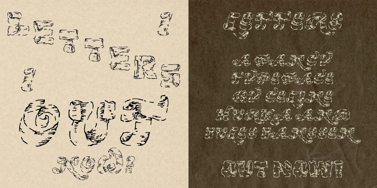
Letters by Céline Hurka & Jules Janssen
Letters is a display typeface designed by Céline Hurka & Jules Janssen, available in regular and italic styles. Designed for experimental use, it performs best at large sizes.
It derives from a historical interest in the depiction of paper within the realm of printed matter, such as teared ribbons and ornamental backgrounds. It’s a silly examination that tries to render the material quality of paper through the world of vectors, eventually finding a way back onto the paper and therefore living in the false self.
Letters is rooted in historical research conducted at the Huis van het Boek archive in The Hague, complemented by hands-on material investigations. Its development has spanned three years, following an organic and intentionally illogical process of burning paper, reviewing historical sources, tracing photographs, and endlessly refining Bézier curves.
|
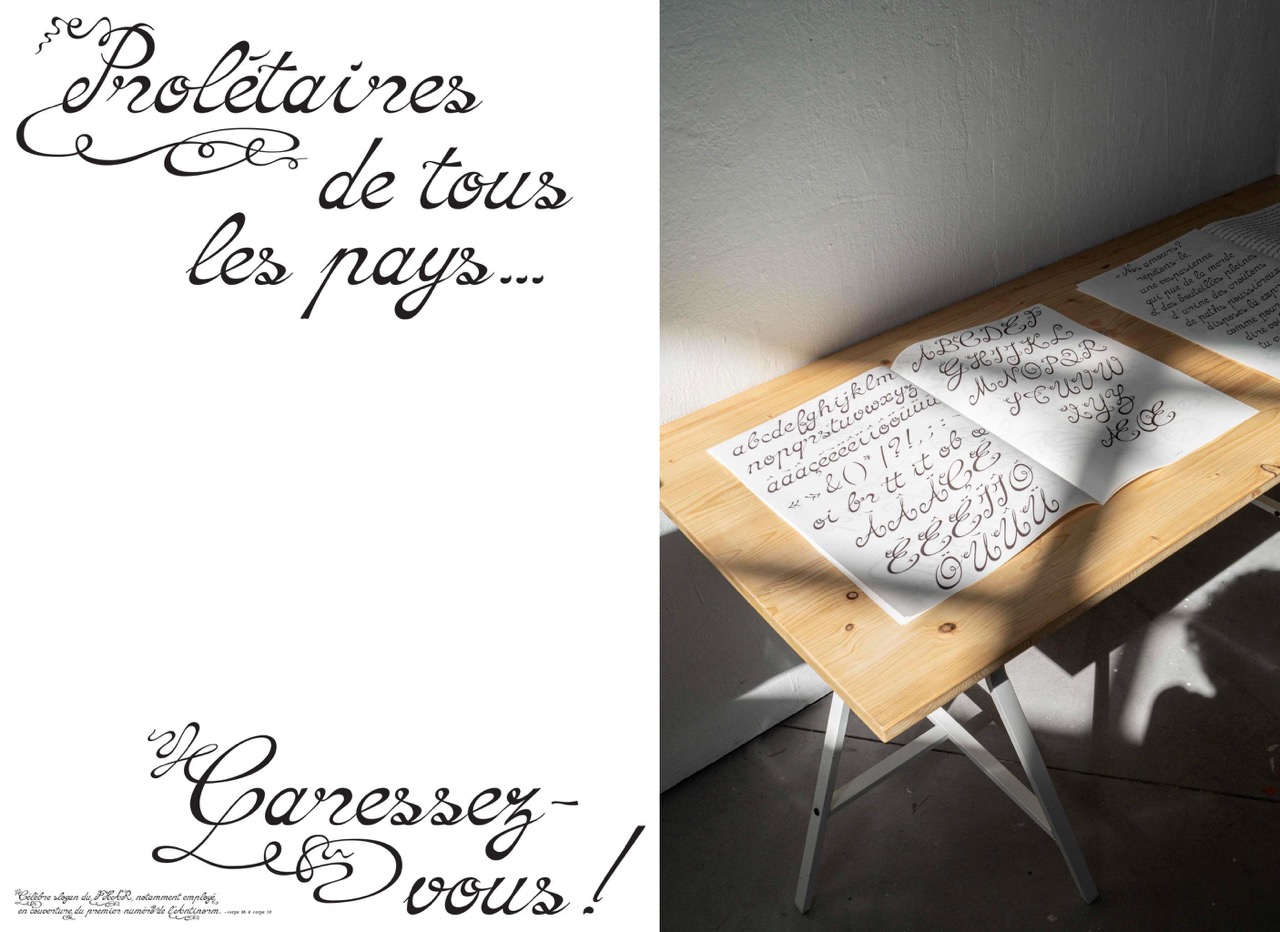
Interlope by Gabriel Dubourg
Interlope, by Gabriel Dubourg, is a script typeface. It is inspired by a lettering printed on the cover of the first issue of Interlopes, a magazine published by the Homosexual Liberation Group of Lyon from 1977 to 1979.
The original lettering was drawn in an amateur calligraphic style, in a DIY spirit that represents well the independant homosexual press from the 70's in France. The digital font keeps those features as an homage, and displays a large range of ligatures and ornamental alternate glyphs, mimicking the fantasy of the original lettering.
|
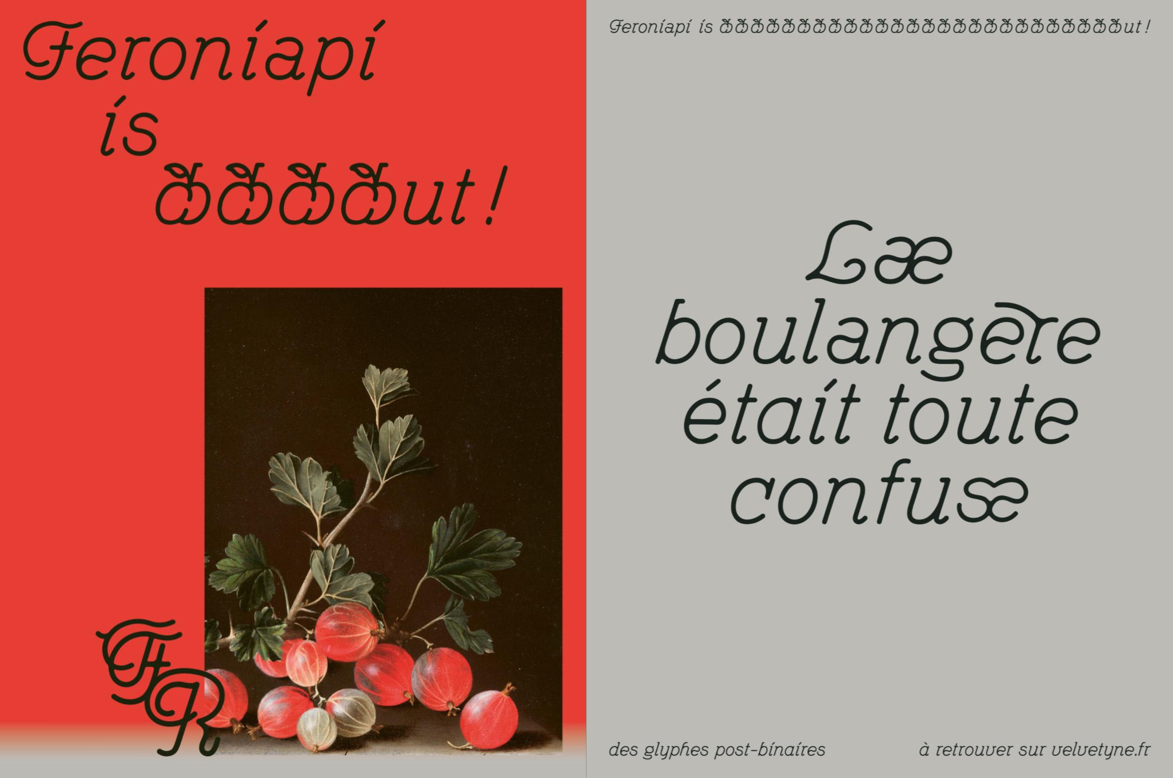
Feroniapi by Julienne Richard
Feroniapi is a redesign by Julienne Richard of Peter Wiegel's Feronia font. Fork's work began as part of the design of the visual identity for the Palais des Fêtes, an iconic dance venue showcasing Strasbourg's Art Nouveau architecture. The main inspirations are Art Nouveau curves and popular dances. The design strives for simplicity and accessibility. The artwork is smoothed and enhanced with useful features such as a set of post-binary ligatures (thanks to the QUNI from Bye Bye Binary); vowel variations; Art Nouveau-style frieze patterns; and a set of fruits and vegetables dingbats. Enjoy!
Peter Wiegel is a great source of inspiration for us. For years, he has been distributing free fonts on Cat Fonts. We are delighted to share a typeface inspired by him.
|
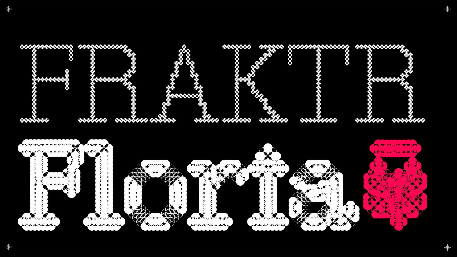
Flor de Ruina by Felipe Sanzana
Drawn by Felipe Sanzana, Flor de Ruina is born from the life that emerges in the fracture, in the fissure. Its variants are a conceptual process that emulates the life cycle of a flower, therefore each glyph germinates, blooms, withers, and finally fissures. Designed as a tool to make the words visible, that unsettles, questioning the automatic reading so prevalent in typographic tradition by proposing a system that slows down reading, resting on its form and its meaning. It finds beauty in discomfort, it's designed to interrupt.
|
(っ◔◡◔)っ Find us on Mastodon
Frenquetly Asked Questions / Help us, Donate!